Measure Team
Evolving a product for product teams
Roles
UX Strategy, UI & Interaction Design, Design System, Branding
Overview
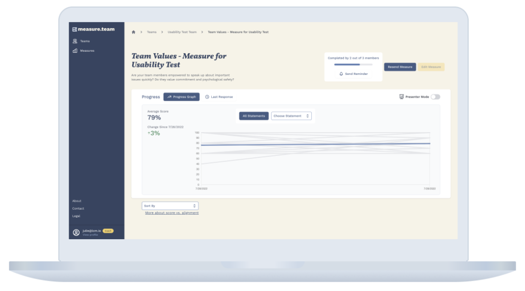
At Last Call Media, I had the opportunity to lead a redesign of the Measure Team web app.
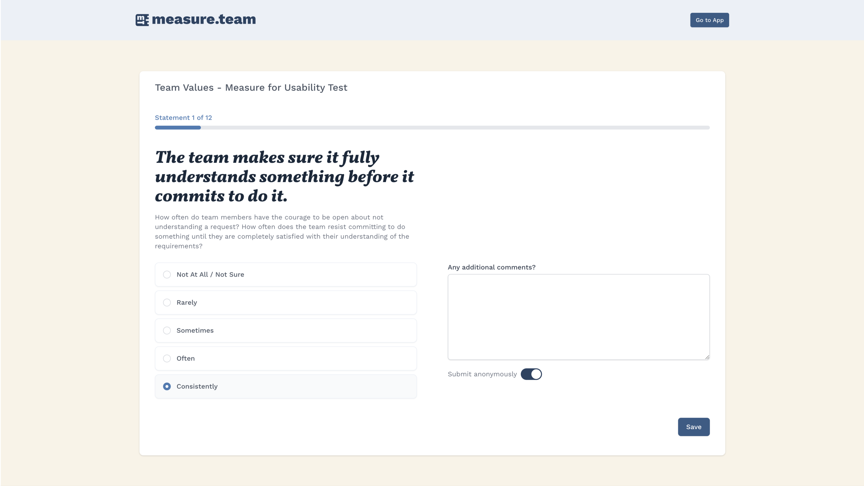
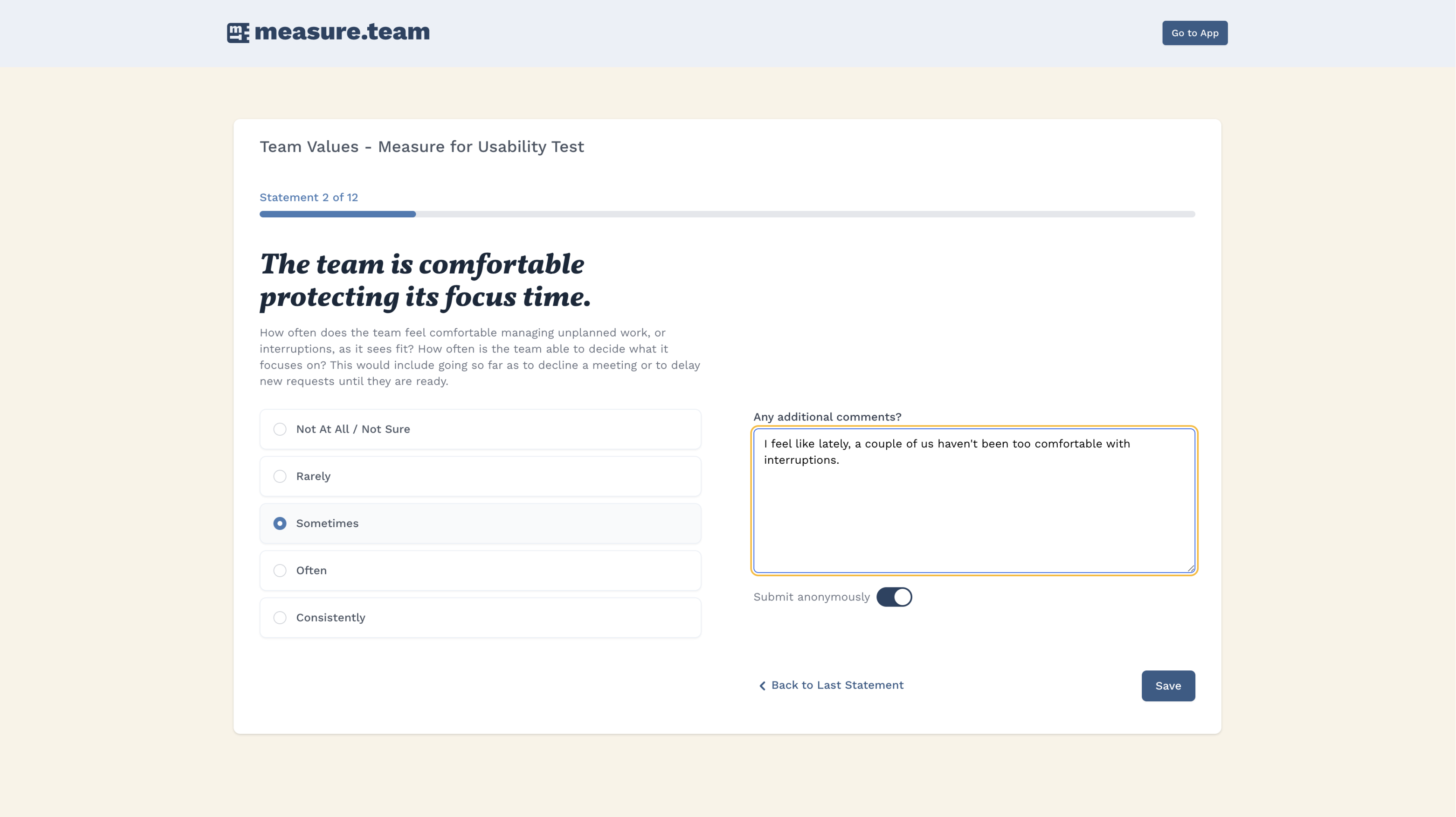
This internal product, created by the company’s CEO, helps team leaders (including Product Managers, Scrum Masters, and Agile Coaches) measure their teams’ progress over time. Team members can evaluate their team in areas such as agility, DevOps, and team values, by taking quantitative surveys (“measures”) periodically. The first version was live and used by customers, but the visual and UI design had not been updated in a few years.
At the start of this project, there was a large backlog of features and design improvements that were based on stakeholder input and user feedback since the initial launch.
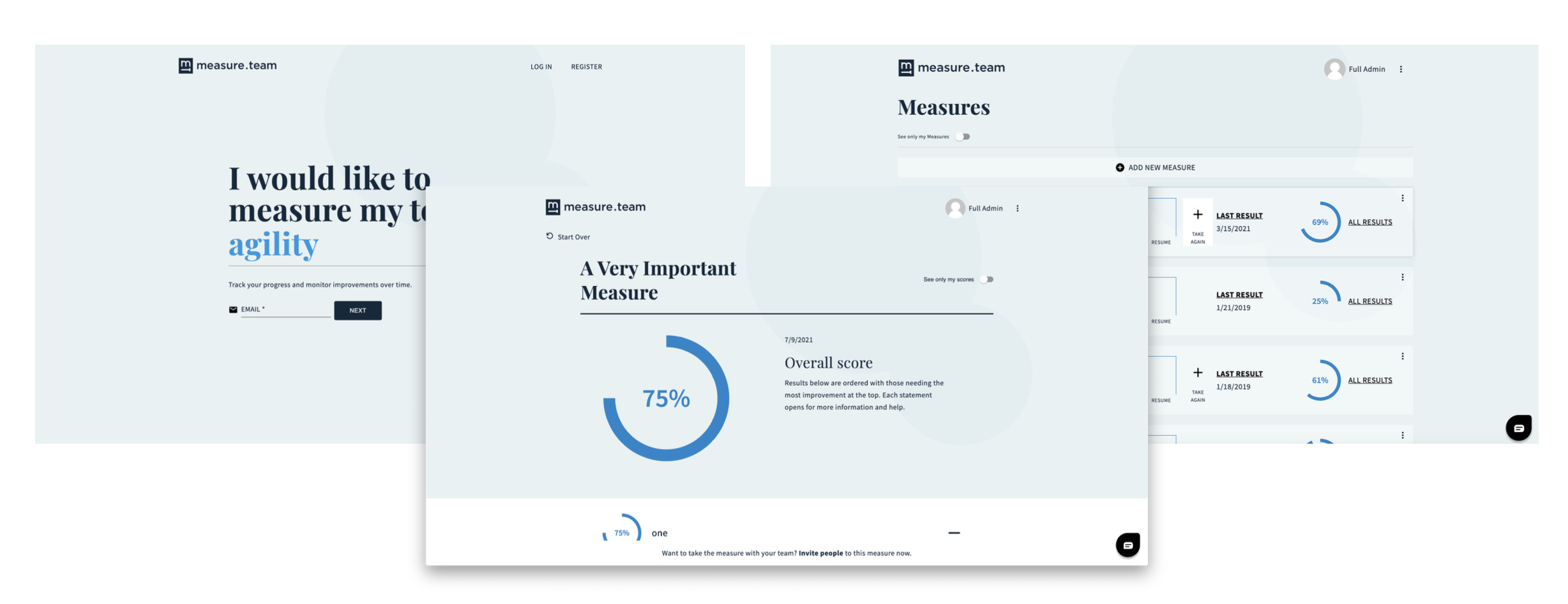
Because Measure Team was an internal project, it was used to test new frameworks, tools, and processes. The Lead Developer wanted to test out Tailwind CSS / UI to learn more about the framework. Some of the UI elements in the new version are directly out of Tailwind, some are completely custom, and some are a combination of both.
Project Goals
1. Create a new MVP that includes all functionality from the existing app, using Tailwind UI components when possible.
2. Add additional features / functionality from the backlog prior to release (to be determined by stakeholder input, ongoing usability auditing, and feedback from existing users).
Refreshing the Brand and UI design
The design team felt that the color scheme and fonts could be warmer and more welcoming, while still keeping a blue hue as a primary color. We added gold as a secondary color to add more variety to the original color scheme, along with some recognizable alert colors. The logo became slightly bolder, and we added a couple of logomark variations.
Our team created an updated design system, “Compass”, in Figma. We used Zeroheight to hold design documentation and specs for developers.

Challenges
– Stakeholders were excited to roll out the new version, and they wanted to add many new features before the release. The design team was careful to push back against adding any features that were based on stakeholder assumptions or that would sacrifice quality for the sake of adding another feature into a sprint.
– However, the stakeholder / user relationship was a bit atypical here because in this case, the stakeholders are users. The CEO and other internal team members who contributed ideas for features fit the persona of either team leaders or product team members. This didn’t mean that additional user research and testing wouldn’t be necessary, but it made determining exactly when additional feedback was required a bit challenging.)
– This was a Lean, fast-paced project. The design team needed to be especially proactive in communicating if we needed more time or resources during a sprint.
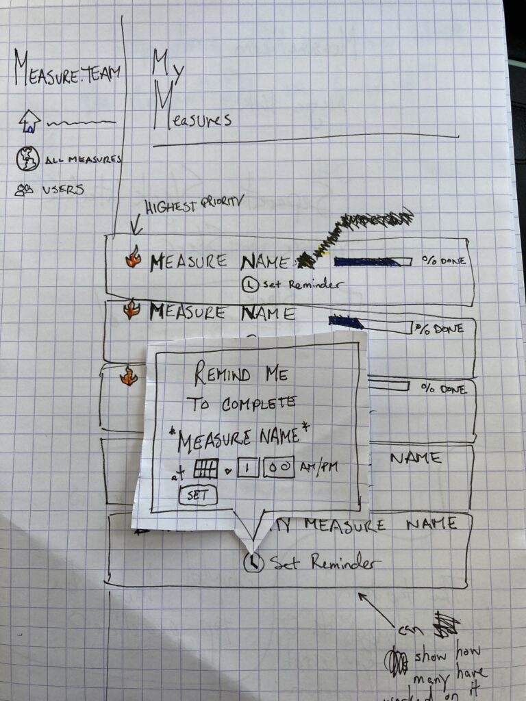
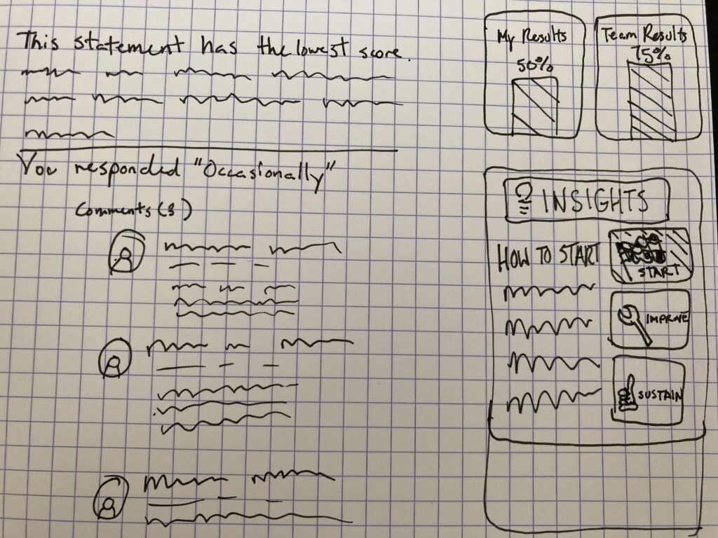
Early Concepts & Sketches
MVP Functionality
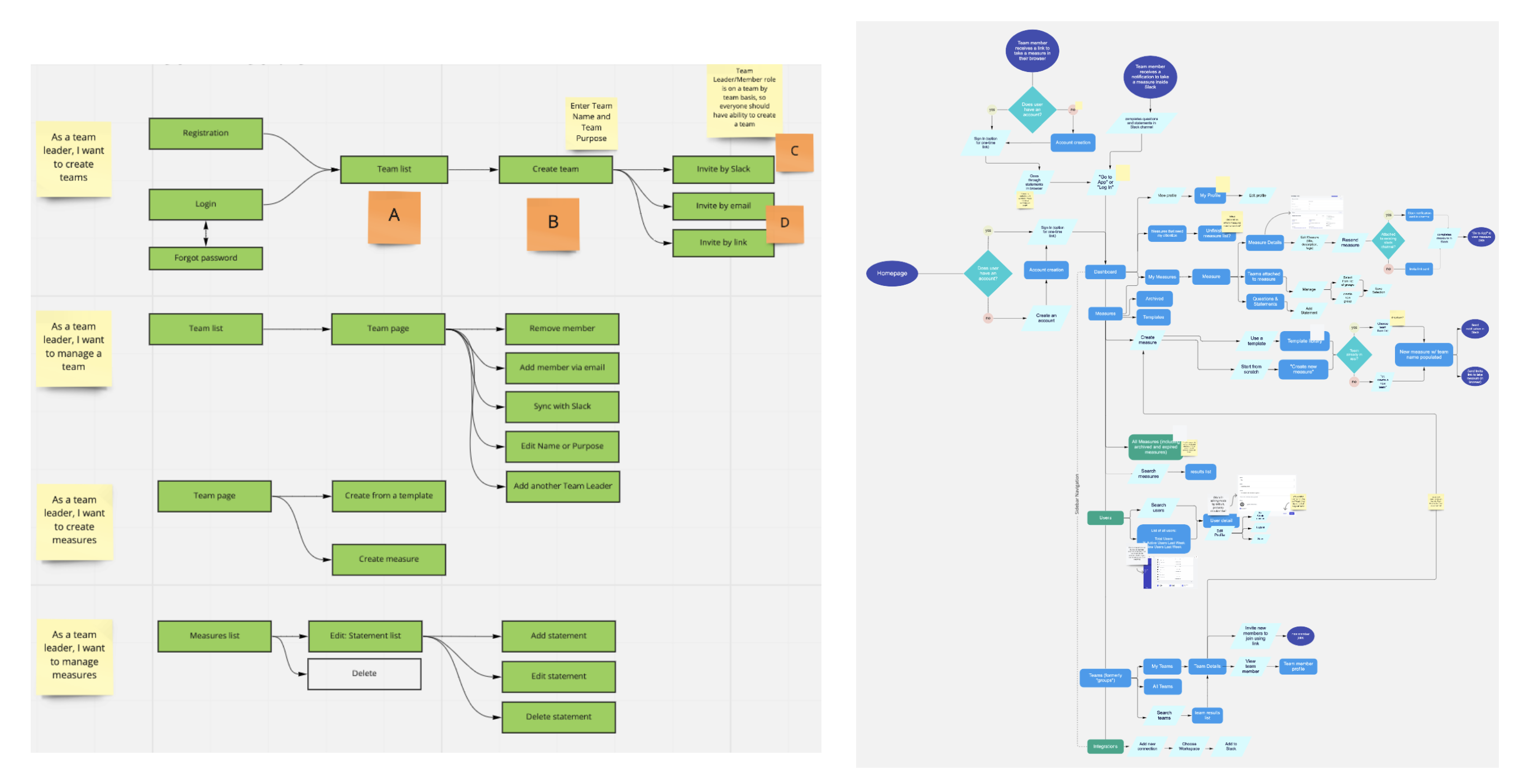
The new MVP had the following requirements:
Tasks for Team Leader
1. Log in to account
2. Create a new team
3. Invite members to join the team via email, Slack, or direct link
4. Create a measure from one of Measure Team’s templates
5. Create a measure from scratch
6. Take a measure
7. Add a comment to a statement in a measure (what the user is rating)
8. Send a measure to the team
9. View personal measure results
10. View the team’s collective measure results
11. Log out of account
Tasks for Team Member
1. Log in to account
2. Take a measure
3. Add a comment to a statement in a measure (what the user is rating)
4. View personal measure results
5. View the team’s collective measure results
6. Log out of account
Post-release feature additions
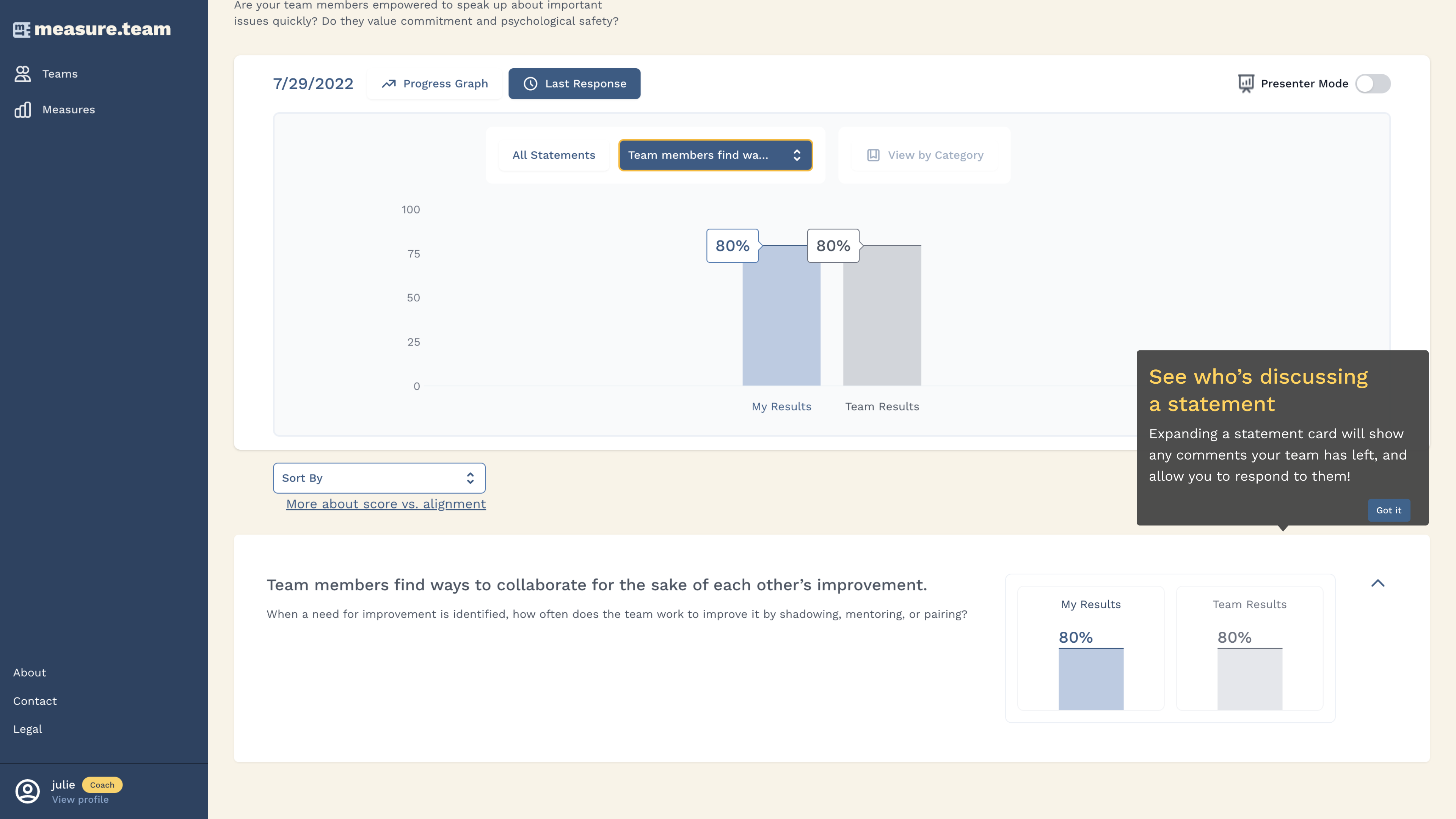
After the release of the MVP, we received feedback from some team leaders using the product that a “presenter mode” would be useful when viewing measure results. They discovered that during retros / team meetings when they shared their screen to go over measure results, they only wanted to show the team’s results and not their personal responses.
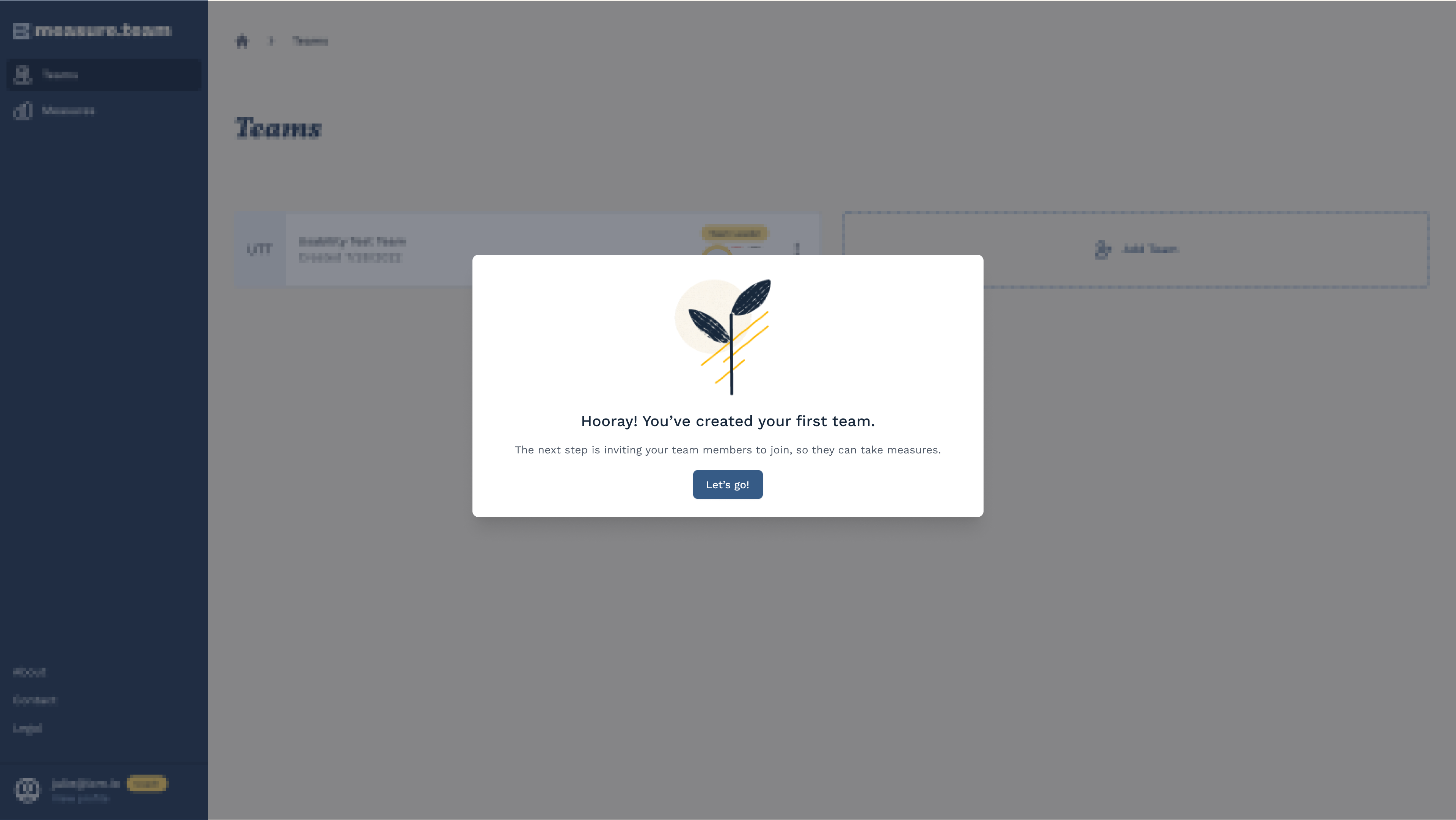
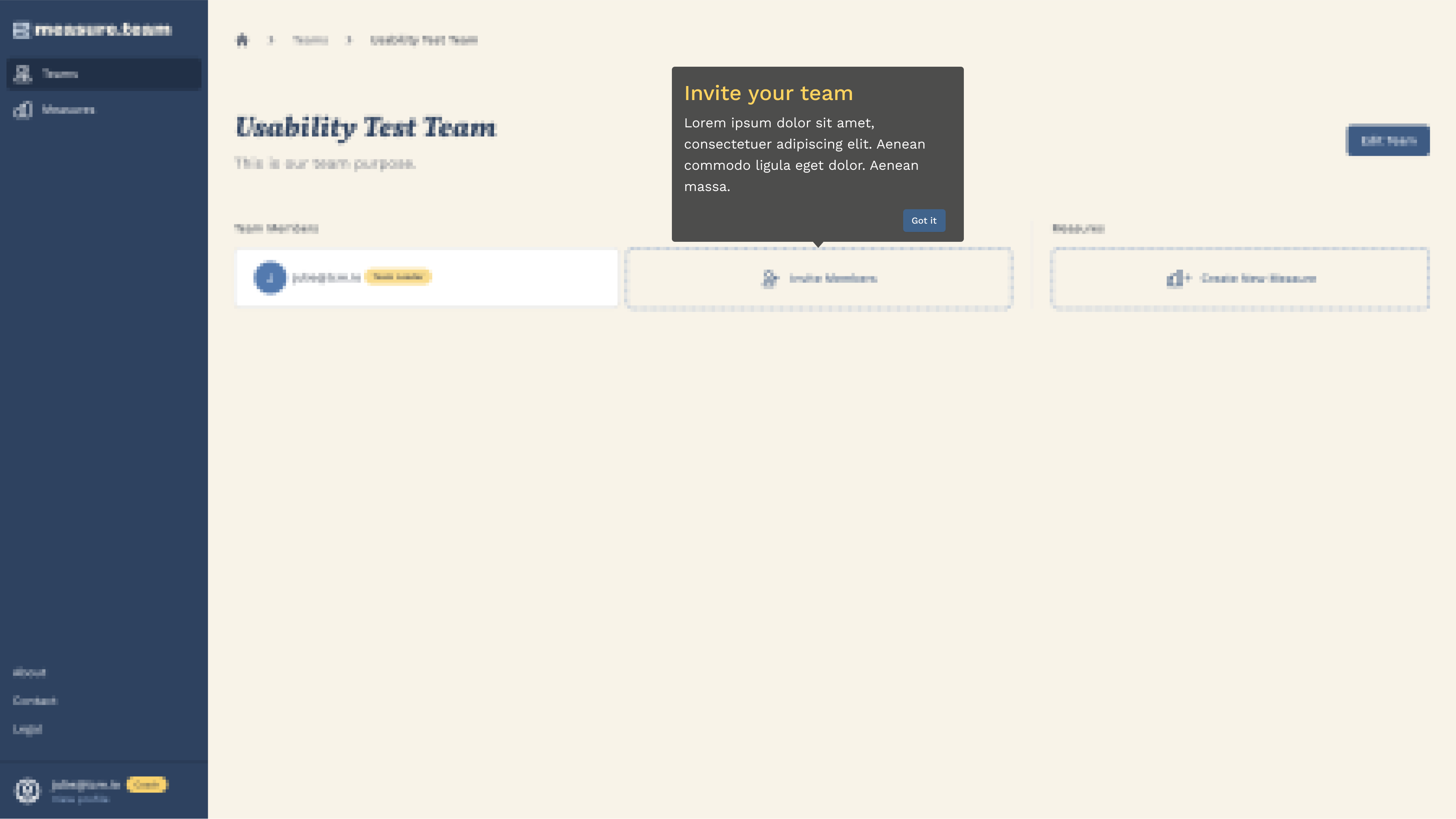
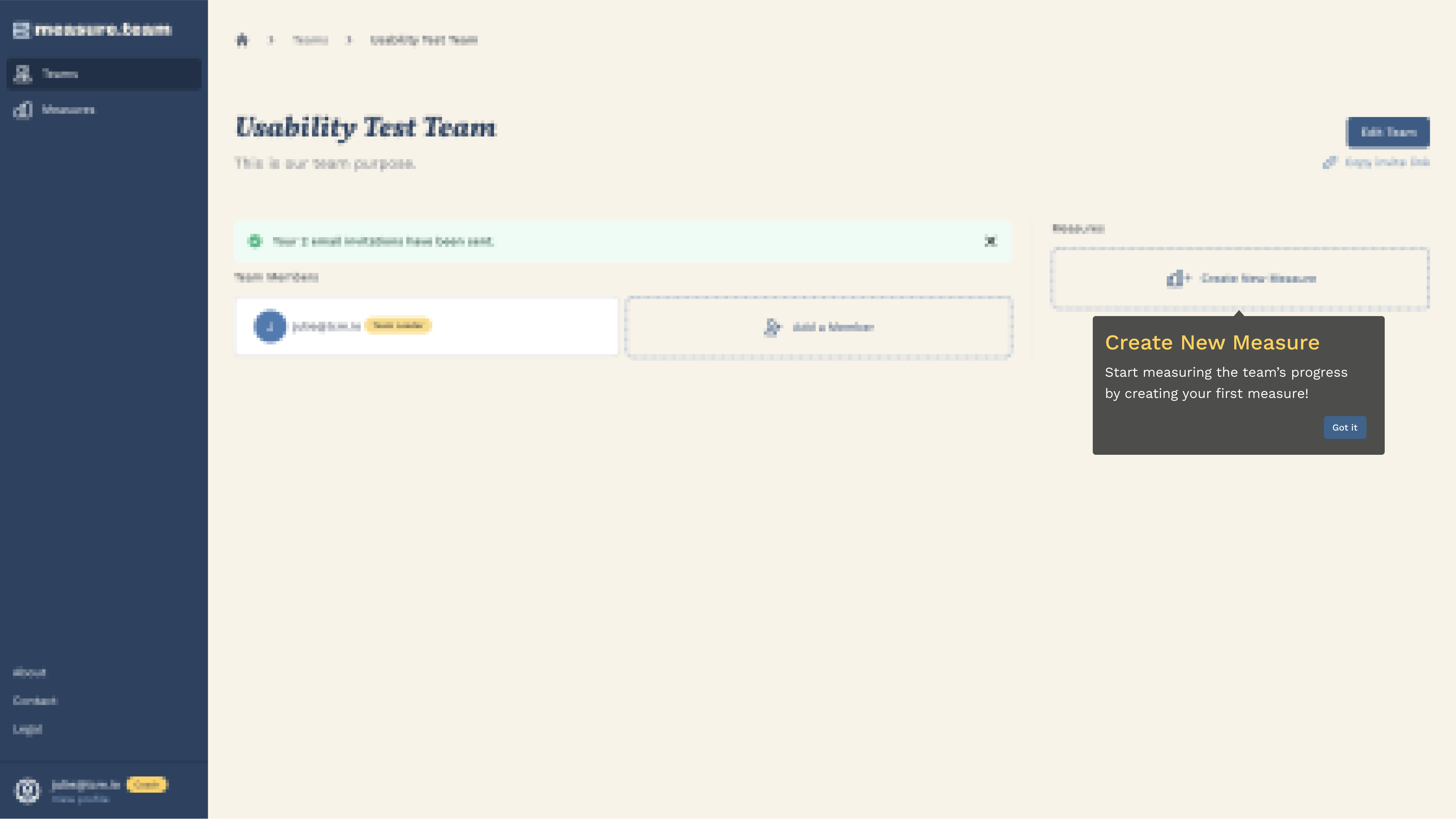
Additionally, because the app included a lot of tasks, we added a brief onboarding tutorial.
Reflections
I felt this project really pushed me as a designer due to the pace, the importance of the product to the company, and the persistence needed to balance UX and stakeholder goals, quickly! Despite some (healthy) pressure, I particularly enjoyed working on Measure Team due to the lack of constraints. We were trying out Tailwind, however there was never a time that I came up with a concept for a custom design that the engineering team could not / would not build. This was, and continues to be, a true passion project for those attached to it.
Were I still working on the design, I absolutely would carve out time to test individual tasks or features. The existing customer feedback was useful, as was our internal team feedback, but… we added a lot of new UI elements and functionality in the new version. I intended on conducting relatively short, small-scale usability tests to begin prioritizing design improvements. Ideally, the team would establish some baseline usability measures.
(Whoa. That just became a little meta, there!)
©2024 Julie Isabel Cohen
