RollAgain
iOS app for board game lovers
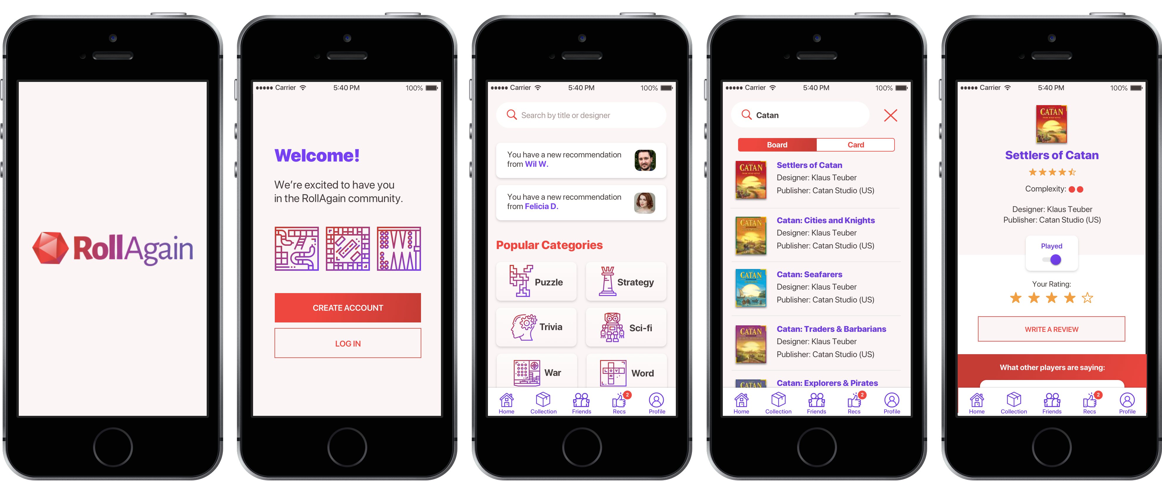
Roles
User Research, Information Architecture, Interaction Design, UI Design, Prototyping, Usability Testing, Branding
Note: This is a fictitious project that was part of DesignLab’s UX Academy curriculum.
Project Length
4 weeks / 80 hours
Tools
Sketch, InVision, Illustrator, Useberry
Background
RollAgain is a board and card game inventory app for iOS. Inspired by GoodReads, RollAgain wanted to take a more user-centric approach to their app, adding features and flows that make it delightful for people to use. They wanted to take advantage of mobile app features such as a barcode scanner and notifications.
Research
In order to determine how to evolve the app, I had these main research goals:
– Discover the features users consider most useful in an inventory app.
– Discover any frustrations from using competitor sites or apps.
– Discover design patterns users prefer while reviewing or sharing their collections.
Competitive Analysis
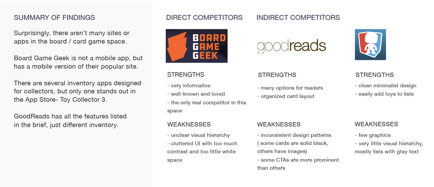
Surprisingly, there are barely any competitors in this space! There’s the well-known boardgamegeek.com, which is just a website and doesn’t have an app version.. The only popular inventory app for any type of collectible is called Toy Collector 3 (oddly enough, there’s no Toy Collector 1 or 2), which has a completely bare bones design… but great reviews in the iTunes Store. GoodReads deals with a totally different type of inventory but was important to analyze as well.
User Interviews
I interviewed 6 participants between the ages of 27 and 48 who regularly play board or card games and have used any inventory app. They answered questions on the importance of games in their lives. Then, I observed them as they used boardgamegeek.com to complete a task (find a game) and asked them to evaluate that experience.
I learned that games were important to all of the participants because they allow them to bond with friends and family. They also use them as a way to meet new people and learn more about their personalities.
Every participant found the content in boardgamegeek.com to be cluttered and hard to read. There was a lot of confusion due to the large number of categories on the site, so most participants searched for a game using the global search field.
The interviews also revealed that user needs were (in order of priority):
– Search by title / predictive search
– for each game description to include complexity, age, cost, and number of players
– concise and obvious game categories
– for friends to be able to give personal recommendations
– ratings and user comments
– account creation
The most common frustrations were:
– too much content on one page
– overcomplicated UI design
– “dreary” or “chaotic” feeling when using the site
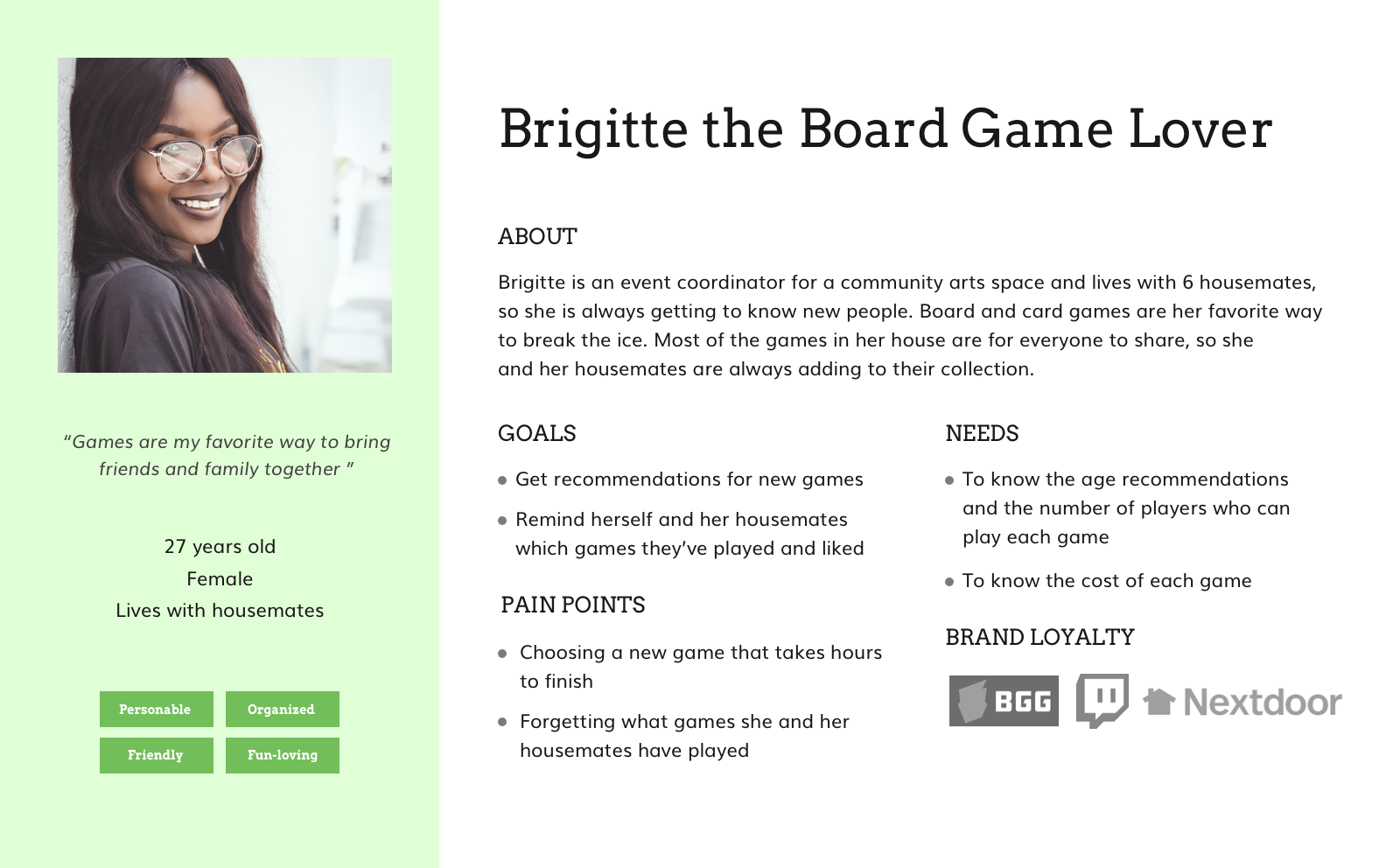
Based on this feedback, I created a user persona: Brigitte.
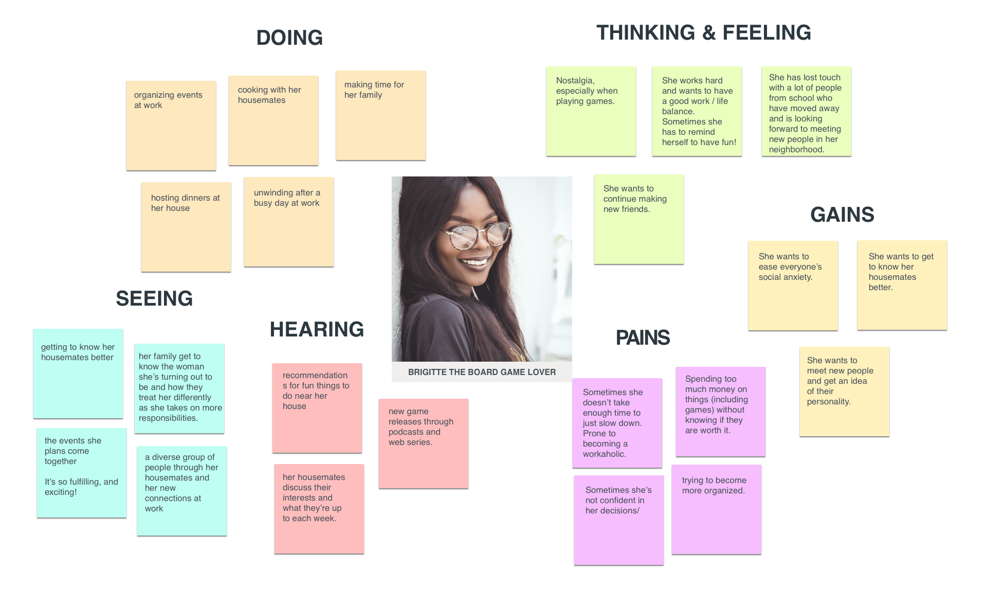
In order to further empathize with Brigitte, I made an empathy map showing her perceptions.
Information Architecture
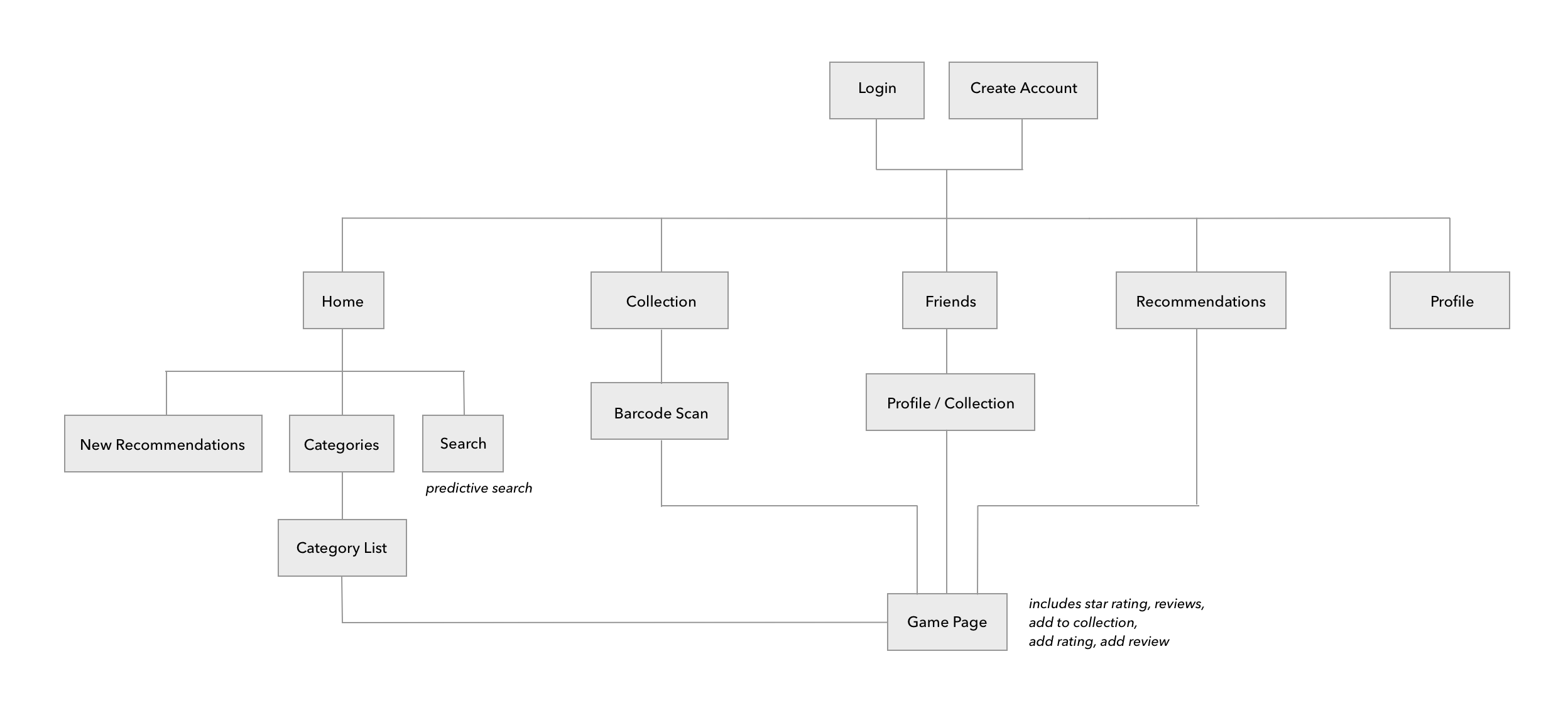
RollAgain’s structure needed to be simple and straightforward. Searching for games would be as easy as possible, with a predictive search or category search option on the home screen. New recommendations from friends would pop up immediately on the home screen as notifications. And, the user’s game collection, friends, older recommended games, and profile information would be one tap away.
Interaction Design
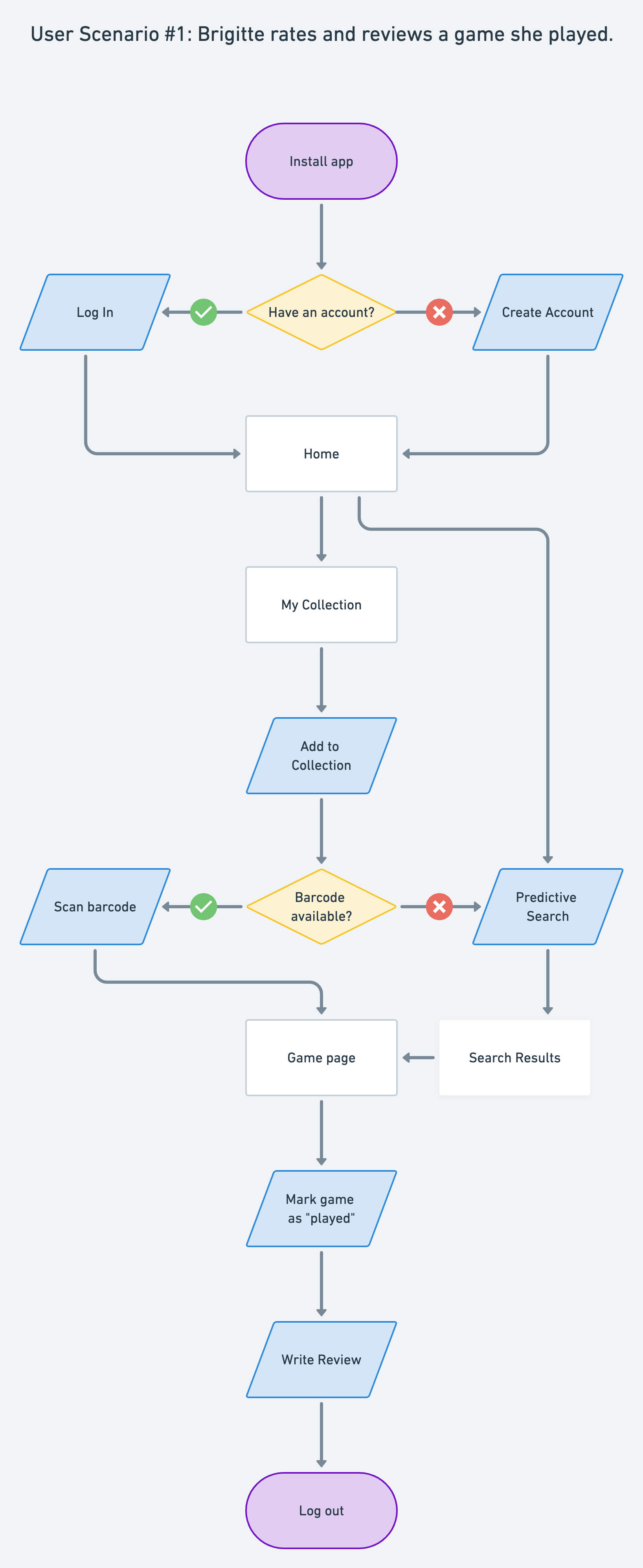
For Brigitte, one of the most important features of RollAgain would be to rate and review a game. So, I focused on that user scenario given the time constraint of this project.
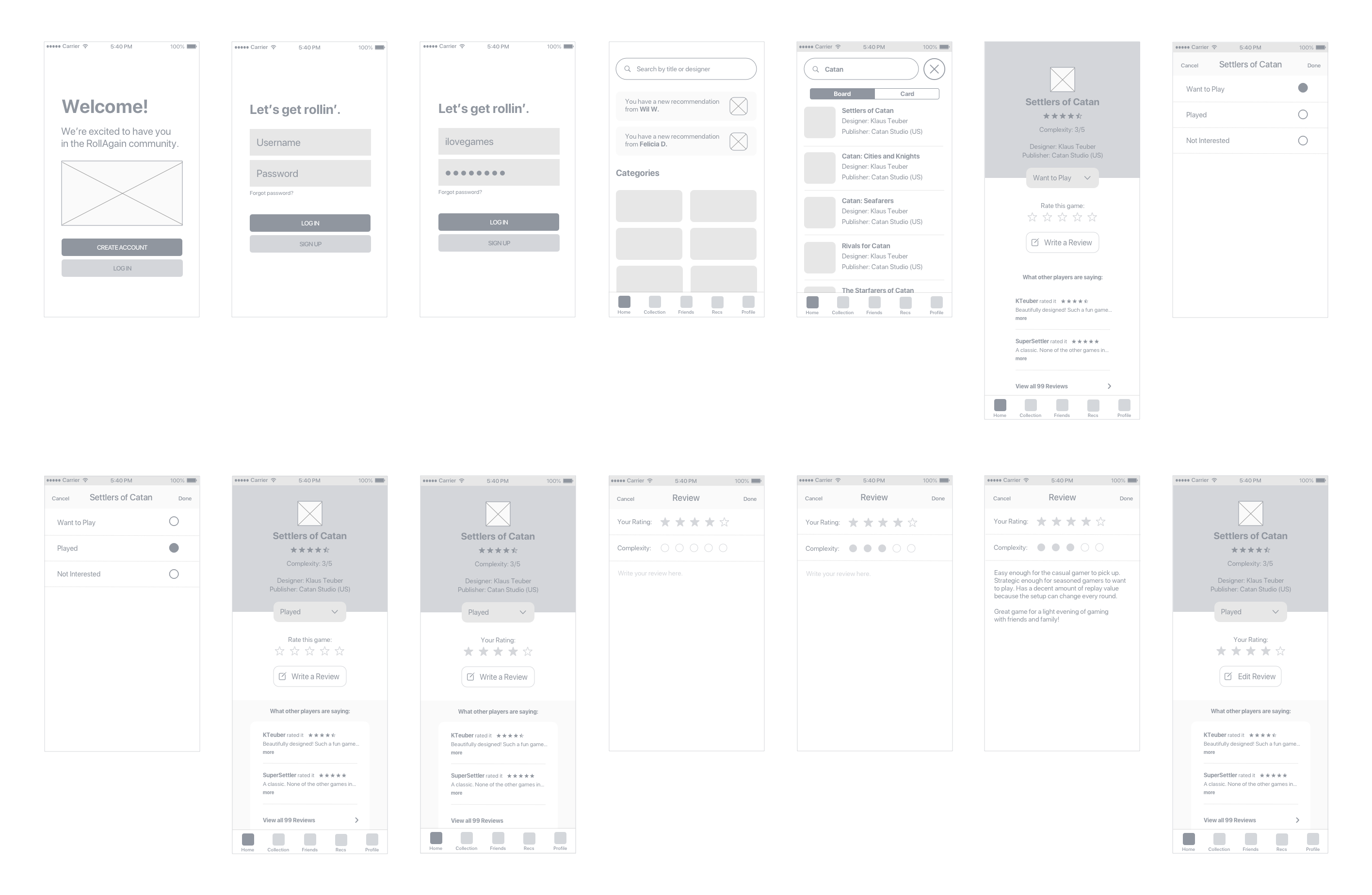
To test the layout and flow before adding too much detail, I made a prototype from the mid-fidelity wireframes and ran a quick test on 5 people using Useberry. None of the testers had issues completing the tasks, but some suggested that there could be a more streamlined way of marking off a game to show it was played (instead of opening a separate screen with radio buttons). It just seemed a little clunky.
Brand Identity
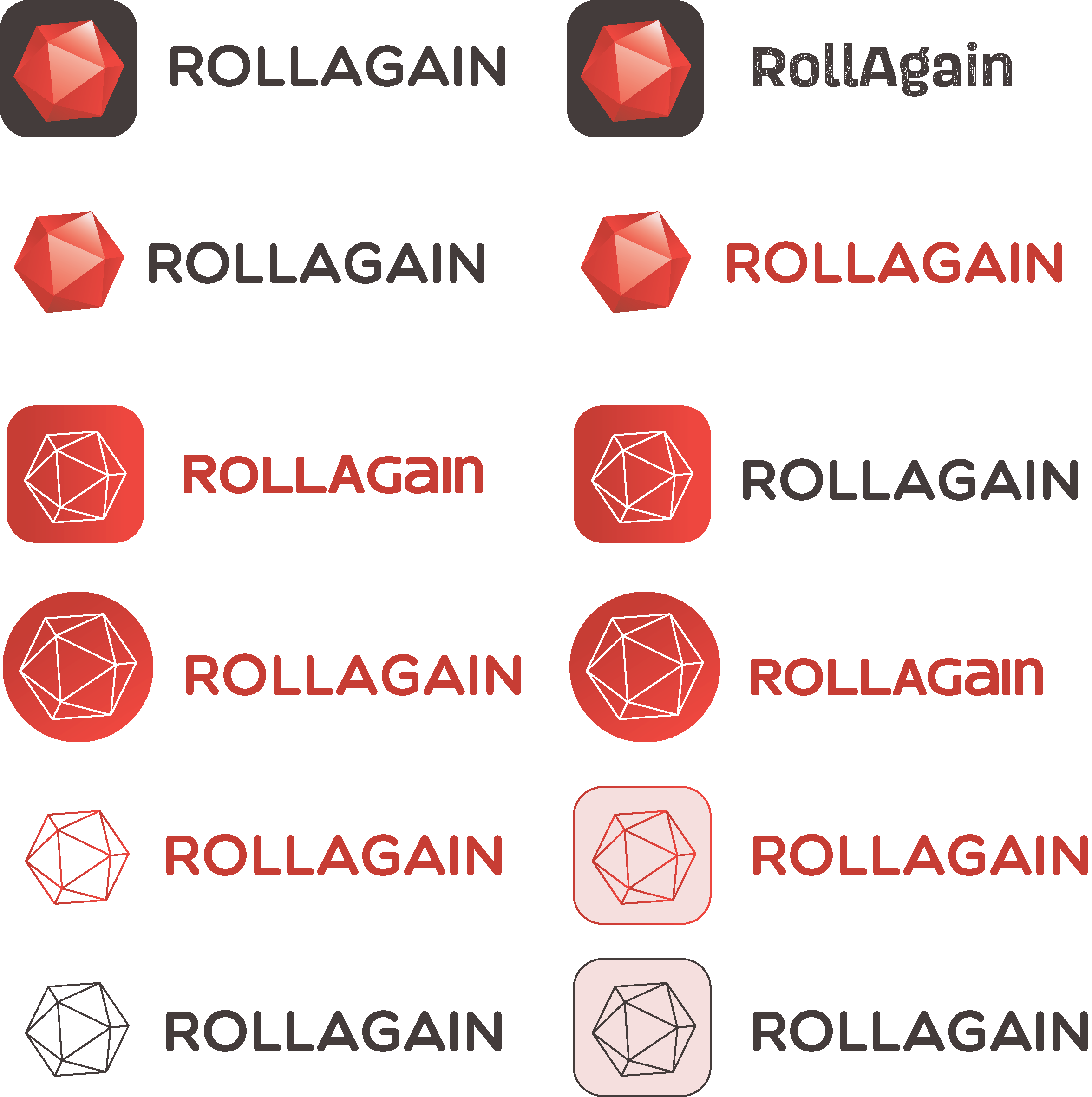
Research definitely highlighted the emotional and social component of playing games. I wanted RollAgain’s brand to reflect that, and to communicate playfulness and happiness.
Early Concepts
Final Version

UI Design
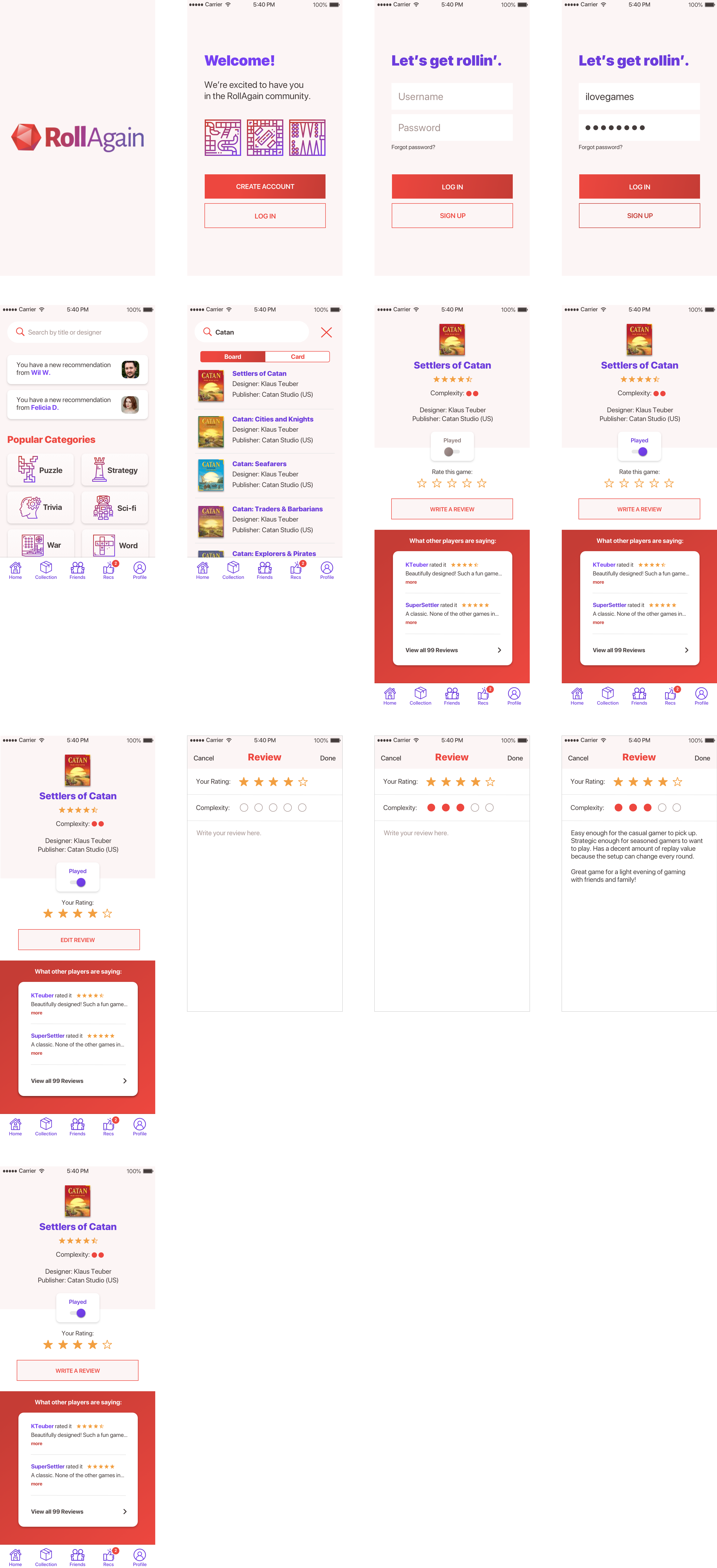
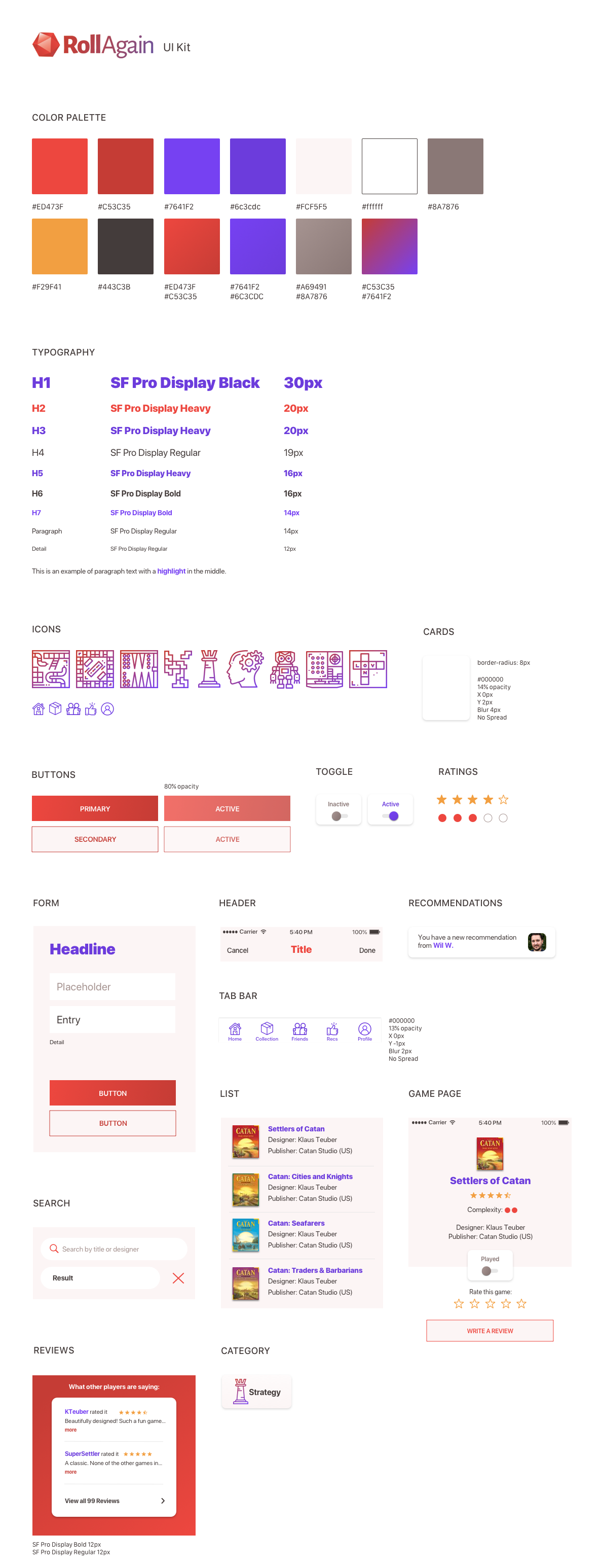
I updated the clunky “mark as played” feature with a toggle switch and added the new UI styles.
Testing
Then, I put together an updated prototype to see if there were any changes in the usability.
I ran another test on 13 people.
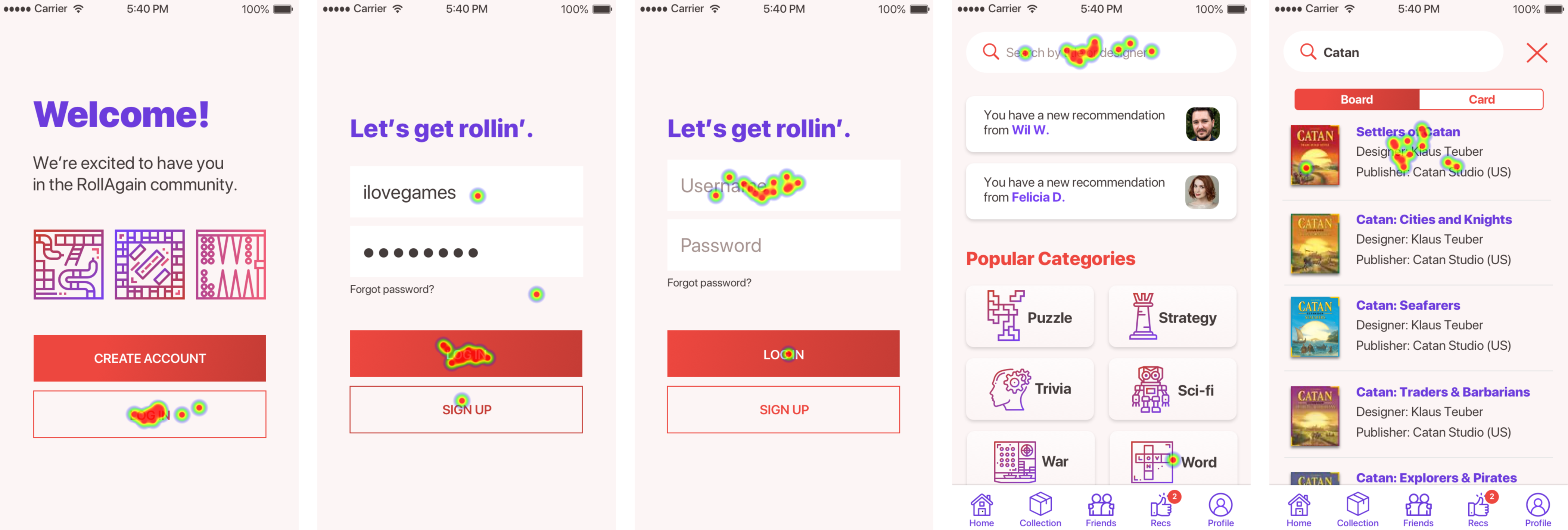
All but one tester completed every task. There was some confusion with the labeling of the new toggle switch. By default, it said “Want to Play”, which confused most of the testers. It was not intuitive that toggling it would show “Played”. Also, the text size of the “done” prompt that completed the last task seemed too small to a couple of testers.
So, the next iteration had only one label (“Played”) greyed out by default. That made more sense. And, I made the “done” prompt a little bit bigger.
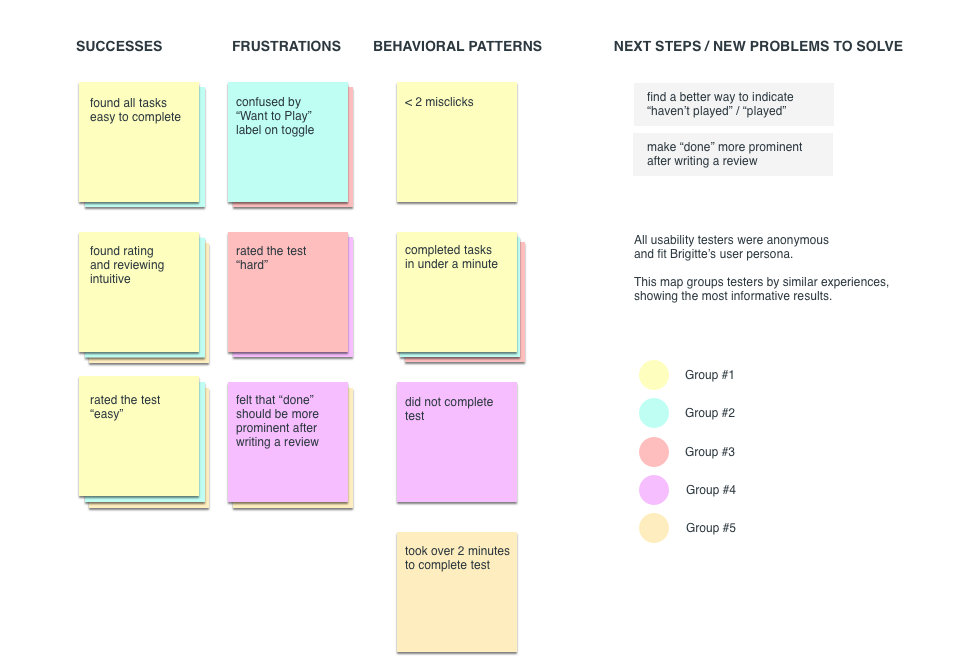
This affinity map shows a summary of observations and feedback from the testing.
Reflection
This project gave me more of an understanding about ways to prevent confusion during a remote usability test. I broke the tests down into more sections, gave more detailed instructions, and almost over-explained in order to prevent the obstacles that occured in previous projects.
This was definitely a fun one for me, being a game lover myself. People opened up to me a bit more in this project as they discussed the role of games throughout their life and why this app would be useful to them.
Had there not been a time constraint, I would definitely continue to test the design and design the remaining features.
